Frank Skinner's career at Universal spanned nearly thirty years, from 1938 to 1966. The composer did yeoman's work, as did others ranging from Hans Salter in the '30s to Henry Mancini in the '50s, under the music department's head, Joseph Gershenson. Like Paramount, but unlike Warner Bros., orchestral underscore for a film was often a group job, for which Gershenson alone received screen credit for music supervision.
I am currently finishing up a project to digitize more than 60 films for which Skinner himself composed an orchestral underscore. The films are mostly from the late 1940s through about 1960, VHS dubs from television a decade or so back, when the American Movie Channel (AMC) was still showing a large number of Universal-International films without commercial breaks. A majority, unfortunately, are in widescreen format that has been reduced by pan-and-scan, but AMC clearly had access to excellent prints and, apart from the formatting changes, image and sound track quality are quite acceptable, even when passed through television and VHS to mpg files.
Skinner worked to formula in a musical style that was the lingua franca for Hollywood in the 1930s but had begun to sound a bit old-fashioned when paired with high-quality widescreen image tracks in the 1950s. His music for action scenes (sword fights, battles, etc.), in particular, sounds dated, as if it were stock music taken from 1930s B-films. On the other hand, his main title cues stand out as remarkably tuneful: Skinner often gives a perfunctory nod to the clichéd opening maestoso, then quickly drops into a soaring melody whose style may or may not be directly related to the film's setting or story. These tunes are generally too intense ("heavy") to be associated with the female lead--they typically recur in dramatic emotional situations between the principal male and female characters. In that sense, one might say, they mark an advance on the 1930s-era two-part main title cue. (See HtM, chapter 6, for discussion of the design of establishing sequences.)
Tuesday, January 1, 2013
Monday, August 27, 2012
Week 1 lectures (2010)
This post was ported from the defunct blog Hearing the Movies II. These are Jim's description of class lectures and activities for the beginning of spring semester 2010. Later entries can be found under the "pedagogy" tag.
I used the following examples for my first week of lectures, which were keyed to Ch. 1 of Hearing the Movies:
I started with the scene from Catch Me If You Can (2002), discussed in the introduction to Part 1 (pp. 1-3) and again in Ch. 1 (pp. 7-8). I played the scene twice, with class discussion after each viewing. We then did a masking exercise, using the Second Botched Meeting sequence from Sleepless in Seattle, discussed on pp. 20-25. We first watched the sequence with no sound, and I had the students talk about what sort of sound they expected and why. We then watched the sequence with sound.
The second class—my class meets twice a week, 75 minutes for each class—we started with a masking exercise using the same scene from Sleepless, this time reversing the procedure, beginning by masking the image and then watching the sequence with image and sound. I led the class in discussion after each.
We then worked with part of the Waterloo Station sequence from The Bourne Ultimatum (2007), starting again with a masking exercise: first, no image (we did this twice); then, no sound track; then both together. In this case I divided the students into three groups and had the first group concentrate on the dialogue, the second group on the music, and the third on the effects. I instructed the first group to note the number and type of voices as well as tempo and dynamic of delivery; the second group to note the basic mood, tempo, dynamic and instrumentation for major points of change; and the third group to identify sound source or to describe sound as best as they could. I thought this example worked exceptionally well, and I would recommend the example.
The third example came from The Fellowship of the Ring (2001), discussed on pp. 11-12. Here, I had the students discuss the five types of music in the sequence and how they differed in narrative function: 1. the atmospheric music as Frodo awakens (this music also appears at the very beginning of the film over the New Line Cinema logo); 2. the "mythic" music accompanying Gandalf's flashback; 3. pastoral music accompanying the appearance of Sam; 4. enchanted vocal music for Rivendell; 5. pastoral music accompanying appearance of Bilbo.
The final example was simply a viewing of Boston Common Scene from Good Will Hunting (1997), pp. 25-30.
I used the following examples for my first week of lectures, which were keyed to Ch. 1 of Hearing the Movies:
I started with the scene from Catch Me If You Can (2002), discussed in the introduction to Part 1 (pp. 1-3) and again in Ch. 1 (pp. 7-8). I played the scene twice, with class discussion after each viewing. We then did a masking exercise, using the Second Botched Meeting sequence from Sleepless in Seattle, discussed on pp. 20-25. We first watched the sequence with no sound, and I had the students talk about what sort of sound they expected and why. We then watched the sequence with sound.
The second class—my class meets twice a week, 75 minutes for each class—we started with a masking exercise using the same scene from Sleepless, this time reversing the procedure, beginning by masking the image and then watching the sequence with image and sound. I led the class in discussion after each.
We then worked with part of the Waterloo Station sequence from The Bourne Ultimatum (2007), starting again with a masking exercise: first, no image (we did this twice); then, no sound track; then both together. In this case I divided the students into three groups and had the first group concentrate on the dialogue, the second group on the music, and the third on the effects. I instructed the first group to note the number and type of voices as well as tempo and dynamic of delivery; the second group to note the basic mood, tempo, dynamic and instrumentation for major points of change; and the third group to identify sound source or to describe sound as best as they could. I thought this example worked exceptionally well, and I would recommend the example.
The third example came from The Fellowship of the Ring (2001), discussed on pp. 11-12. Here, I had the students discuss the five types of music in the sequence and how they differed in narrative function: 1. the atmospheric music as Frodo awakens (this music also appears at the very beginning of the film over the New Line Cinema logo); 2. the "mythic" music accompanying Gandalf's flashback; 3. pastoral music accompanying the appearance of Sam; 4. enchanted vocal music for Rivendell; 5. pastoral music accompanying appearance of Bilbo.
The final example was simply a viewing of Boston Common Scene from Good Will Hunting (1997), pp. 25-30.

Thursday, September 8, 2011
Masking Exercise
Here is a quotation from Dimitri Tiomkin that could serve to introduce the masking exercise:
To comprehend fully what music does for movies, one should see a picture before the music is added, and again after it has been scored. Not only are all the dramatic effects heightened, but in many instances the faces, voices, and even the personalities of the players are altered by the music.Source: Dimitri Tiomkin, "Composing for Films," Films in Review 2.9 (1951): 21. (The full article runs pp. 17-22.)
Tuesday, August 30, 2011
Administrative Post
I've just discovered a stash of emails that were sent to the link on the site here. This spring and summer, Google has been transferring the accounts associated with the site, and during that transition, some emails seem not to have arrived immediately. I have now answered all the emails that have appeared in the inbox. If you have sent a message and not received a reply, please resend your inquiry.
We apologize for the confusion.
We apologize for the confusion.
Saturday, August 20, 2011
Studio Scene
A little self-deprecating humor from The Score, the official newsletter of the American Society of Music Arrangers.
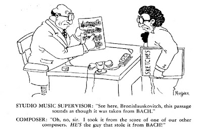 Image Source: The Score, 2.7-8 (1945) (PDF).
 Image Source: The Score, 2.7-8 (1945) (PDF).
Thursday, August 18, 2011
Marlin Skiles Says...

The American Society of Arrangers and Composers has posted PDFs to four volumes of The Score, the organization's newsletter, from the late 1940s. At the time, the organization claimed membership by the prominent orchestrators and arrangers working in Hollywood. The following, short article by composer and arranger Marlin Skiles is typical of the materials to be found in the newsletter
Among the subscribers to THE SCORE, there are undoubtedly many people who wonder just how the arranger functions in the music profession. Consequently, I think it would be well to give a description of just what the arranger's place is in musical society.
Most of our popular music is written for voice with piano accompaniment. As there are many mediums of performance other than vocal, it is necessary then to have this music transcribed, or re-written so that it is possible to perform it in another manner.
This is the arranger's job. Every time a piece of popular music is performed in any other version than that of voice and piano, an arrangement or orchestration has to be made for the particular way it is to be performed.
The arranging profession came to the fore with the advent of the jazz era, and it is a singularly unique American development. It is a definite expression of the American way of life, caused by the desire for individualism, variety and the demand for something new and different.
A competent arranger is expected to be, among other things, an excellent musician, a clever "idea" man, an inventor of new styles or patterns, and a composer of sorts. He is supposed to shun the thought of imitating any previously employed devices in his idiom.
This, of course, is quite an assignment, and it is remarkable that so many thousands of music writers in this country pass the test. The arranger has become as necessary to our present popular music production as the mouthpiece is to the wind player or the bow to the fiddler.
It can truthfully be said that without the arranger, easily 80 per cent of our popular songs would never have been written. This estimates the percentage of popular songwriters who cannot so much as write their own melodies.
Hence jazz itself would never have risen above the cacophonous state in which it was born, had not the arranger appeared on the scene.
Source: "Marlin Skiles Says," The Score 1.3 (March 1944), 1. (Link is to PDF.)
Image source: Color masthead was excerpted from the cover posted here.
Wednesday, January 12, 2011
YouTube analysis-comparison exercise
The sheer volume of items posted to YouTube makes it easy to construct elementary comparison exercises that draw on audiovisual analysis. The point of the exercise is to give students practice very early in semester (as they read HtM Ch. 1) but isolate the work from the complex narrative contexts of feature films and from the students' learned viewing habits for films.
The task is to describe different visual tracks as they relate to a single audio track. I chose performances of a musical composition because they're easy to find on YouTube and often are relatively stable there (that is, not taken down), but more so because the limits of the musical text allow us to treat the sound track more or less as a control, against which we can more easily compare different collections of images, still and moving. Tempo remains a variable in the audio track as well, of course, but we will minimize that by looking first at three visualizations of the same recorded musical performance.
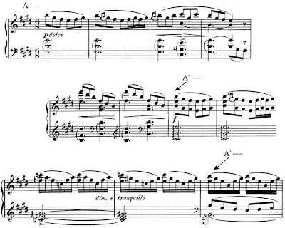
The composition is "Morgenstimmung" (Morning Mood), the first movement in Edvard Grieg's Peer Gynt Suite No. 1, Op. 46. The design is simple: A - A' (expanded) - A'' (as coda or ending section). Here are the corresponding moments in musical notation (piano reduction only).
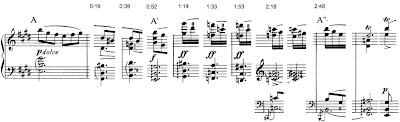
Timings for the three sections in the performance by the Berlin Philharmonic under Herbert von Karajan are included at the top of the next example, which charts the principal harmonic changes through the movement. (The image is a thumbnail -- click on it to see the original.)
Version no. 1: link. [Link is broken; checked on 3-08-2024.] One might think of this as a "control" since the image track is static, nothing but a title card. In fact, however, this is in some ways the most difficult version to study because the students must be able to pay attention to their attention, so to speak. Once they guess that the image is probably not going to change, attention shifts away from it to the music, in a radical version of what Claudia Gorbman calls the "pure cultural musical code," that is, music as performance. A clever student who refuses the let the image track go entirely may relate the starkness of the black background to the audiovisual sparseness of a video that is only music.
Version no. 2: link. [Link is broken; checked on 3-08-2024.] The same recording (played twice!) with a slide show of images. Questions to consider: how are changes to a new image timed to the music track? (Generally, they avoid synchronization -- images change shortly before the downbeat of a new bar. Exceptions @ about 2:40.) What is the effect of the lack of synchronization @ important form articulations in the music? (If images had changed at those moments, the images would suddenly have seemed relatively "important", leading to speculation about reasons for that importance. Something similar happens in a couple cases where the slide is onscreen noticeably longer than the others.) What kind of narrative content (or expectation for narrative continuity) is provoked by the slide show? (The obvious one would be the minimal narrative of dawn in many different locales -- but here again there are a few exceptions, slides that obviously depict mid-day. One might also ask whether chronological continuity is important -- one slide of a darkened tree and a pre-dawn planet seems out of place. In the case of narrative, it is not important to come up with answers -- what is important is to notice the fact of imposing (or trying to impose) narrative continuity on the images.) The ending of the first playthrough is obviously clumsy in the image track (the photo of Grieg appears twice in short order and then the slide show starts up a third time a few seconds before the piece ends).
Version 3: link. [Link checked on 3-08-2024.]An upgrade to the slide show that makes a very good comparison for no. 2. Here the poster is playing with simple effects applied to a video of a fire in a fireplace. Because the editing is plainly done by someone (no. 2's slide show could have been an app on autopilot), the questions of intention and design arise more seriously. (If students know about it, a discussion of the associations brought up by the context of the YouTube "Kaminfeuer" trope could be interesting -- here again, it's not the information that is important but the realization of the power of these external associations to shape or guide the viewing -- very much like genre expectations in feature films.)
Version no. 4: link. [Link checked on 3-08-2024.]Not Karajan. By comparison with no. 2, both performance and slide show seem frenetic.
Version no. 5: link. [Link is broken; checked on 3-08-2024.] Here is what Gorbman really meant by the "pure" code in feature films: a filmed performance of the piece by an orchestra. The camera is static. Compare to this performance that has multiple cameras and was edited: link.
The task is to describe different visual tracks as they relate to a single audio track. I chose performances of a musical composition because they're easy to find on YouTube and often are relatively stable there (that is, not taken down), but more so because the limits of the musical text allow us to treat the sound track more or less as a control, against which we can more easily compare different collections of images, still and moving. Tempo remains a variable in the audio track as well, of course, but we will minimize that by looking first at three visualizations of the same recorded musical performance.
The composition is "Morgenstimmung" (Morning Mood), the first movement in Edvard Grieg's Peer Gynt Suite No. 1, Op. 46. The design is simple: A - A' (expanded) - A'' (as coda or ending section). Here are the corresponding moments in musical notation (piano reduction only).

Timings for the three sections in the performance by the Berlin Philharmonic under Herbert von Karajan are included at the top of the next example, which charts the principal harmonic changes through the movement. (The image is a thumbnail -- click on it to see the original.)

Version no. 1: link. [Link is broken; checked on 3-08-2024.] One might think of this as a "control" since the image track is static, nothing but a title card. In fact, however, this is in some ways the most difficult version to study because the students must be able to pay attention to their attention, so to speak. Once they guess that the image is probably not going to change, attention shifts away from it to the music, in a radical version of what Claudia Gorbman calls the "pure cultural musical code," that is, music as performance. A clever student who refuses the let the image track go entirely may relate the starkness of the black background to the audiovisual sparseness of a video that is only music.
Version no. 2: link. [Link is broken; checked on 3-08-2024.] The same recording (played twice!) with a slide show of images. Questions to consider: how are changes to a new image timed to the music track? (Generally, they avoid synchronization -- images change shortly before the downbeat of a new bar. Exceptions @ about 2:40.) What is the effect of the lack of synchronization @ important form articulations in the music? (If images had changed at those moments, the images would suddenly have seemed relatively "important", leading to speculation about reasons for that importance. Something similar happens in a couple cases where the slide is onscreen noticeably longer than the others.) What kind of narrative content (or expectation for narrative continuity) is provoked by the slide show? (The obvious one would be the minimal narrative of dawn in many different locales -- but here again there are a few exceptions, slides that obviously depict mid-day. One might also ask whether chronological continuity is important -- one slide of a darkened tree and a pre-dawn planet seems out of place. In the case of narrative, it is not important to come up with answers -- what is important is to notice the fact of imposing (or trying to impose) narrative continuity on the images.) The ending of the first playthrough is obviously clumsy in the image track (the photo of Grieg appears twice in short order and then the slide show starts up a third time a few seconds before the piece ends).
Version 3: link. [Link checked on 3-08-2024.]An upgrade to the slide show that makes a very good comparison for no. 2. Here the poster is playing with simple effects applied to a video of a fire in a fireplace. Because the editing is plainly done by someone (no. 2's slide show could have been an app on autopilot), the questions of intention and design arise more seriously. (If students know about it, a discussion of the associations brought up by the context of the YouTube "Kaminfeuer" trope could be interesting -- here again, it's not the information that is important but the realization of the power of these external associations to shape or guide the viewing -- very much like genre expectations in feature films.)
Version no. 4: link. [Link checked on 3-08-2024.]Not Karajan. By comparison with no. 2, both performance and slide show seem frenetic.
Version no. 5: link. [Link is broken; checked on 3-08-2024.] Here is what Gorbman really meant by the "pure" code in feature films: a filmed performance of the piece by an orchestra. The camera is static. Compare to this performance that has multiple cameras and was edited: link.
Subscribe to:
Posts (Atom)

