A very interesting play off the famous "Tara" theme in Gone with the Wind could form the basis of a comparison paper. Nathan Platte reveals that the composer, Max Steiner, had actually written jazz/blues versions of the tune for two films just a year or so earlier: link. [Link checked on 3-01-2024.] The films are They Made Me a Criminal (1939)—starring John Garfield, Claude Rains, and Ann Sheridan—and Crime School (1938), which stars Humphrey Bogart and Gale Page. As the titles suggest, both belong to the distinctly Warner Bros. genre of inner city crime and gangster films.
Quite a distance from southern plantations! Platte's explanations and speculation about the transformation from crime film to antebellum romance are stimulating in themselves, and one or more of them might well be explored further in a paper that forms and argues a thesis.
Nathan Platte is the author of Making Music in Selznick's Hollywood (Oxford University Press, 2017): link to publisher page. [Link checked on 3-08-2024.]
Showing posts with label comparison. Show all posts
Showing posts with label comparison. Show all posts
Friday, May 4, 2018
Friday, February 23, 2018
Movie trailer assignment or project
In a post early last year (link) [Link checked on 3-08-2024.] we drew attention to Frank Lehman's discussion of recent Star Wars trailers (link to his post on Musicology Now) [Link updated on 3-08-2024.]. I can't say that I am overly fond of comments threads in general, but the conversation in Frank's post is interesting and informative. James Deaville's subsequent post about trailers to Musicology Now is definitely also worth a look: link. [Link updated on 3-08-2024.]
Between them, these materials could provide suitable background for a class assignment or a student paper project on film trailers. The trailer might make an interesting twist on the screening report (Chapter 6), for example, or on the compare-contrast paper assignment (Chapter 10).
Since trailers are now readily available for a wide range of films, both historical and contemporary, they could be incorporated almost anywhere in the chronological sequence from the classical period onward. Caution: in the transition period, what you will find labeled "trailer" online (even on the most respectable sites like Turner Classic Movies) is often just a clip of one of the film's song performances.
Between them, these materials could provide suitable background for a class assignment or a student paper project on film trailers. The trailer might make an interesting twist on the screening report (Chapter 6), for example, or on the compare-contrast paper assignment (Chapter 10).
Since trailers are now readily available for a wide range of films, both historical and contemporary, they could be incorporated almost anywhere in the chronological sequence from the classical period onward. Caution: in the transition period, what you will find labeled "trailer" online (even on the most respectable sites like Turner Classic Movies) is often just a clip of one of the film's song performances.

Wednesday, January 12, 2011
YouTube analysis-comparison exercise
The sheer volume of items posted to YouTube makes it easy to construct elementary comparison exercises that draw on audiovisual analysis. The point of the exercise is to give students practice very early in semester (as they read HtM Ch. 1) but isolate the work from the complex narrative contexts of feature films and from the students' learned viewing habits for films.
The task is to describe different visual tracks as they relate to a single audio track. I chose performances of a musical composition because they're easy to find on YouTube and often are relatively stable there (that is, not taken down), but more so because the limits of the musical text allow us to treat the sound track more or less as a control, against which we can more easily compare different collections of images, still and moving. Tempo remains a variable in the audio track as well, of course, but we will minimize that by looking first at three visualizations of the same recorded musical performance.
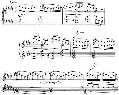
The composition is "Morgenstimmung" (Morning Mood), the first movement in Edvard Grieg's Peer Gynt Suite No. 1, Op. 46. The design is simple: A - A' (expanded) - A'' (as coda or ending section). Here are the corresponding moments in musical notation (piano reduction only).
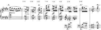
Timings for the three sections in the performance by the Berlin Philharmonic under Herbert von Karajan are included at the top of the next example, which charts the principal harmonic changes through the movement. (The image is a thumbnail -- click on it to see the original.)
Version no. 1: link. [Link is broken; checked on 3-08-2024.] One might think of this as a "control" since the image track is static, nothing but a title card. In fact, however, this is in some ways the most difficult version to study because the students must be able to pay attention to their attention, so to speak. Once they guess that the image is probably not going to change, attention shifts away from it to the music, in a radical version of what Claudia Gorbman calls the "pure cultural musical code," that is, music as performance. A clever student who refuses the let the image track go entirely may relate the starkness of the black background to the audiovisual sparseness of a video that is only music.
Version no. 2: link. [Link is broken; checked on 3-08-2024.] The same recording (played twice!) with a slide show of images. Questions to consider: how are changes to a new image timed to the music track? (Generally, they avoid synchronization -- images change shortly before the downbeat of a new bar. Exceptions @ about 2:40.) What is the effect of the lack of synchronization @ important form articulations in the music? (If images had changed at those moments, the images would suddenly have seemed relatively "important", leading to speculation about reasons for that importance. Something similar happens in a couple cases where the slide is onscreen noticeably longer than the others.) What kind of narrative content (or expectation for narrative continuity) is provoked by the slide show? (The obvious one would be the minimal narrative of dawn in many different locales -- but here again there are a few exceptions, slides that obviously depict mid-day. One might also ask whether chronological continuity is important -- one slide of a darkened tree and a pre-dawn planet seems out of place. In the case of narrative, it is not important to come up with answers -- what is important is to notice the fact of imposing (or trying to impose) narrative continuity on the images.) The ending of the first playthrough is obviously clumsy in the image track (the photo of Grieg appears twice in short order and then the slide show starts up a third time a few seconds before the piece ends).
Version 3: link. [Link checked on 3-08-2024.]An upgrade to the slide show that makes a very good comparison for no. 2. Here the poster is playing with simple effects applied to a video of a fire in a fireplace. Because the editing is plainly done by someone (no. 2's slide show could have been an app on autopilot), the questions of intention and design arise more seriously. (If students know about it, a discussion of the associations brought up by the context of the YouTube "Kaminfeuer" trope could be interesting -- here again, it's not the information that is important but the realization of the power of these external associations to shape or guide the viewing -- very much like genre expectations in feature films.)
Version no. 4: link. [Link checked on 3-08-2024.]Not Karajan. By comparison with no. 2, both performance and slide show seem frenetic.
Version no. 5: link. [Link is broken; checked on 3-08-2024.] Here is what Gorbman really meant by the "pure" code in feature films: a filmed performance of the piece by an orchestra. The camera is static. Compare to this performance that has multiple cameras and was edited: link.
The task is to describe different visual tracks as they relate to a single audio track. I chose performances of a musical composition because they're easy to find on YouTube and often are relatively stable there (that is, not taken down), but more so because the limits of the musical text allow us to treat the sound track more or less as a control, against which we can more easily compare different collections of images, still and moving. Tempo remains a variable in the audio track as well, of course, but we will minimize that by looking first at three visualizations of the same recorded musical performance.
The composition is "Morgenstimmung" (Morning Mood), the first movement in Edvard Grieg's Peer Gynt Suite No. 1, Op. 46. The design is simple: A - A' (expanded) - A'' (as coda or ending section). Here are the corresponding moments in musical notation (piano reduction only).

Timings for the three sections in the performance by the Berlin Philharmonic under Herbert von Karajan are included at the top of the next example, which charts the principal harmonic changes through the movement. (The image is a thumbnail -- click on it to see the original.)

Version no. 1: link. [Link is broken; checked on 3-08-2024.] One might think of this as a "control" since the image track is static, nothing but a title card. In fact, however, this is in some ways the most difficult version to study because the students must be able to pay attention to their attention, so to speak. Once they guess that the image is probably not going to change, attention shifts away from it to the music, in a radical version of what Claudia Gorbman calls the "pure cultural musical code," that is, music as performance. A clever student who refuses the let the image track go entirely may relate the starkness of the black background to the audiovisual sparseness of a video that is only music.
Version no. 2: link. [Link is broken; checked on 3-08-2024.] The same recording (played twice!) with a slide show of images. Questions to consider: how are changes to a new image timed to the music track? (Generally, they avoid synchronization -- images change shortly before the downbeat of a new bar. Exceptions @ about 2:40.) What is the effect of the lack of synchronization @ important form articulations in the music? (If images had changed at those moments, the images would suddenly have seemed relatively "important", leading to speculation about reasons for that importance. Something similar happens in a couple cases where the slide is onscreen noticeably longer than the others.) What kind of narrative content (or expectation for narrative continuity) is provoked by the slide show? (The obvious one would be the minimal narrative of dawn in many different locales -- but here again there are a few exceptions, slides that obviously depict mid-day. One might also ask whether chronological continuity is important -- one slide of a darkened tree and a pre-dawn planet seems out of place. In the case of narrative, it is not important to come up with answers -- what is important is to notice the fact of imposing (or trying to impose) narrative continuity on the images.) The ending of the first playthrough is obviously clumsy in the image track (the photo of Grieg appears twice in short order and then the slide show starts up a third time a few seconds before the piece ends).
Version 3: link. [Link checked on 3-08-2024.]An upgrade to the slide show that makes a very good comparison for no. 2. Here the poster is playing with simple effects applied to a video of a fire in a fireplace. Because the editing is plainly done by someone (no. 2's slide show could have been an app on autopilot), the questions of intention and design arise more seriously. (If students know about it, a discussion of the associations brought up by the context of the YouTube "Kaminfeuer" trope could be interesting -- here again, it's not the information that is important but the realization of the power of these external associations to shape or guide the viewing -- very much like genre expectations in feature films.)
Version no. 4: link. [Link checked on 3-08-2024.]Not Karajan. By comparison with no. 2, both performance and slide show seem frenetic.
Version no. 5: link. [Link is broken; checked on 3-08-2024.] Here is what Gorbman really meant by the "pure" code in feature films: a filmed performance of the piece by an orchestra. The camera is static. Compare to this performance that has multiple cameras and was edited: link.
Subscribe to:
Posts (Atom)

